Before a buyer reads your price, before they read your description, before they scroll to your reviews — they see your product image. And within that image, lighting is one of the most powerful subconscious signals of product value.
This isn't a minor effect. Research in consumer psychology consistently shows that production quality (including lighting) serves as a heuristic for product quality. When a product is photographed with precise, controlled lighting, buyers unconsciously infer that the brand cares about quality — and extend that inference to the product itself.
The converse is equally powerful: a product photographed with flat, harsh, or inconsistent lighting signals cheapness — regardless of the product's actual quality. Buyers resist paying premium prices for products that look like they're photographed for a clearance listing.
The most important lighting variable for perceived value is diffusion — how soft or hard the light source is.
Hard light (bare flash, direct sunlight, bare bulb): - Creates sharp, well-defined shadows - Produces high contrast between lit and unlit areas - Creates specular highlights on shiny surfaces - Signals: budget, industrial, utilitarian - Products that work: hardware, industrial supplies, price-competitive commodities
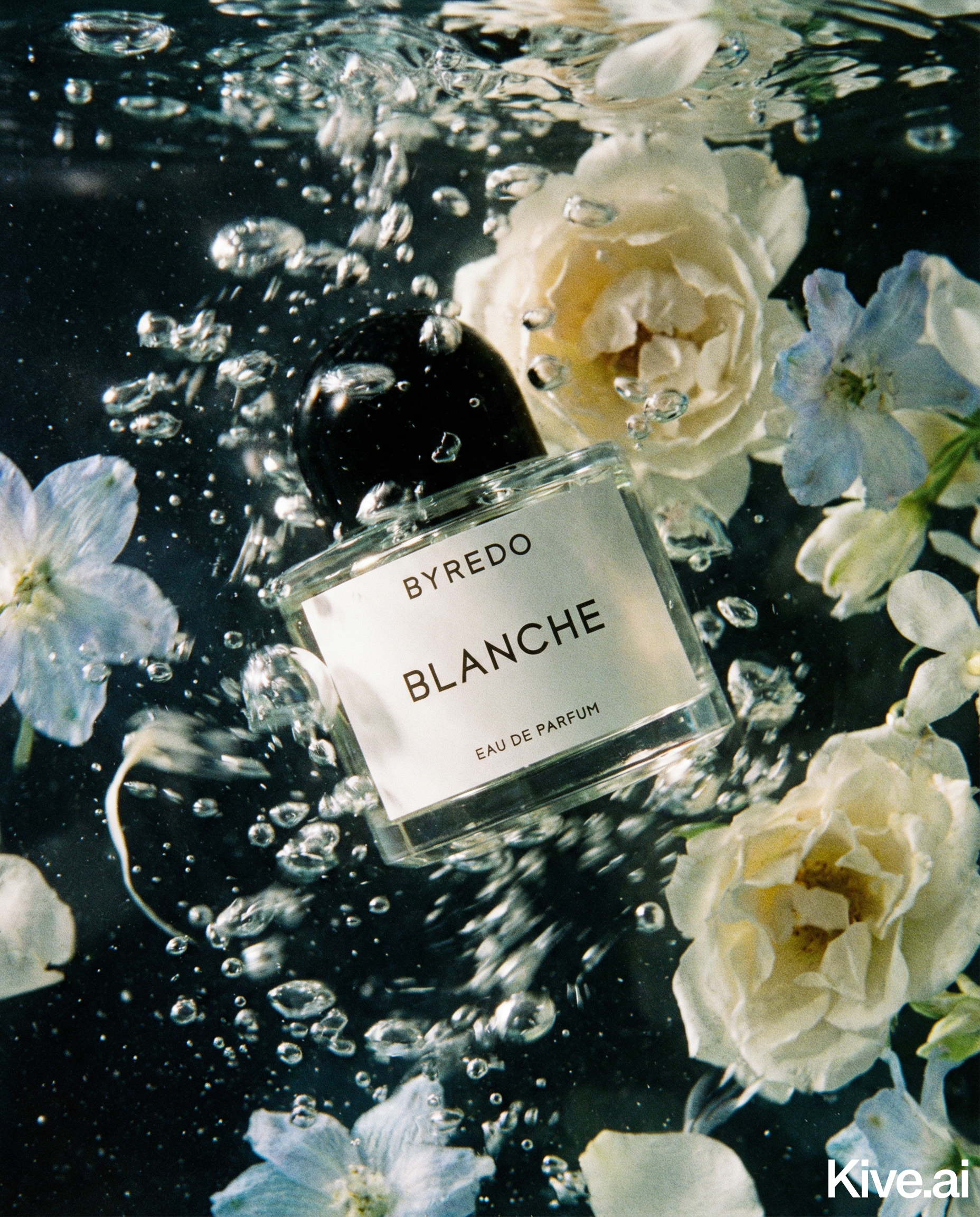
Soft light (large softbox, window light, diffused flash): - Creates gradual transitions between light and shadow - Maintains detail in both highlight and shadow areas - Creates even, controlled highlights on reflective surfaces - Signals: quality, care, precision, premium - Products that work: premium consumer goods, beauty, fashion, luxury
The single highest-ROI change most ecommerce brands can make to their photography is adding a diffusion panel between their light source and their product. A $15 piece of diffusion fabric changes the perceived value of every image.
Lighting colour temperature is measured in Kelvin (K). Different colour temperatures create very different emotional associations:
Warm light (2700–3500K): - Golden, amber-toned light - Associated with comfort, luxury, richness, intimacy - Works for: lifestyle products, food, luxury goods, candles, home décor, premium spirits
Neutral daylight (5000–5500K): - Clean, natural white light - Associated with clarity, accuracy, naturalness - Works for: clothing, accessories, general consumer goods where colour accuracy is paramount
Cool light (6000–7000K): - Blue-white, clinical light - Associated with precision, science, efficiency, cleanliness - Works for: technology, healthcare, supplements (science-backed positioning), industrial products
Sellable's platform turns a single product photo into studio-quality images, cinematic video, and on-brand campaigns — generated, refined on the canvas, and published straight to your store.
Match your colour temperature to your brand's positioning. A premium whisky brand shooting at 6500K looks clinical and wrong. A tech accessory brand shooting at 3000K looks soft and ambiguous.
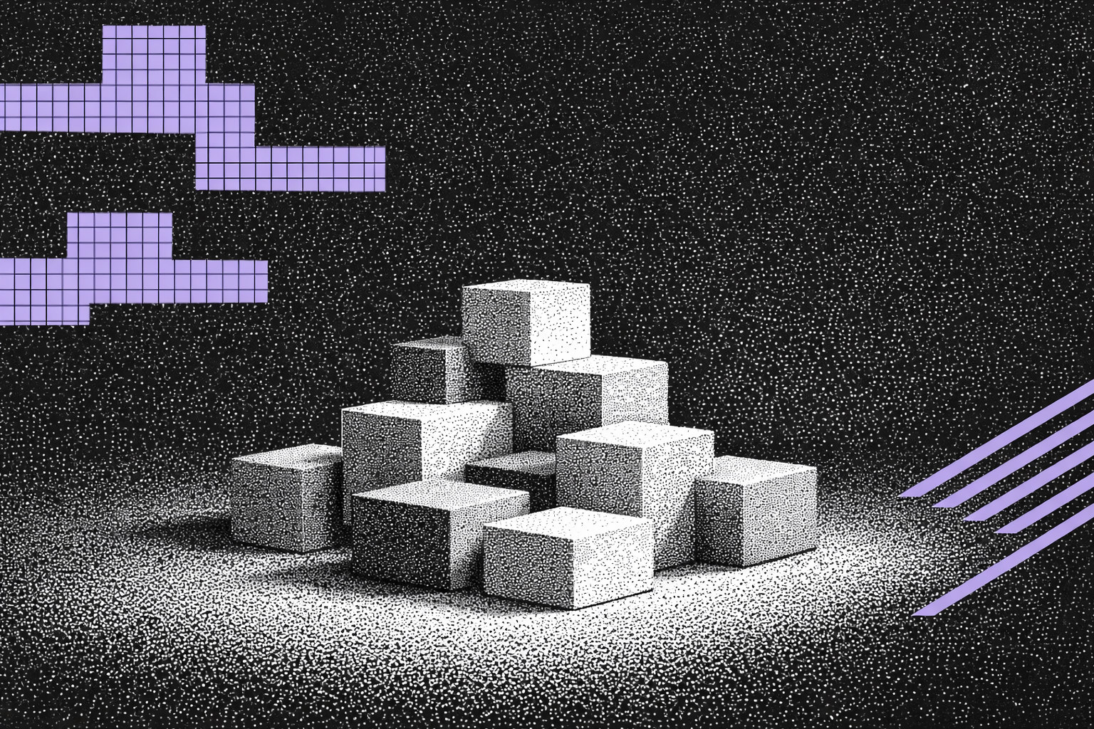
Shadows in product photography are not failures to eliminate — they are design elements that communicate craftsmanship.
Specifically, soft directional shadows beneath and behind a product communicate: - Physical weight and solidity ("this is a real, substantial object") - Dimensionality ("this has depth, texture, and materiality") - Ground contact ("this is a real product, not a digital render")
Compare a product floating in a pure white void (no shadow at all) with a product sitting on a surface with a soft, realistic shadow beneath it. The second version consistently rates as more believable and of higher quality — even when the product itself is identical.
The ideal shadow for most products: a soft contact shadow directly beneath the product (indicating where it touches the surface) plus a very subtle directional shadow behind it (indicating the light source direction). This is achievable in both physical photography and AI generation.
In classical painting — and in premium product photography — light comes from above and to one side. This mimics natural daylight from a window and creates the kind of gradients and shadows that reveal three-dimensionality and material quality.
Flat, front-on lighting eliminates shadows and creates flat images. Dramatic under-lighting creates menacing associations inappropriate for most products. Side-lighting from above is the universally understood signal for premium presentation.
For practical application: - Position your primary light source at a 45-degree angle to the product, slightly above - Use a reflector or fill light on the opposite side at lower intensity (1/3 to 1/4 of the primary) to preserve shadow detail - Maintain this lighting direction consistently across your entire catalogue — it becomes part of your brand's visual identity
If you use traditional photography, implement two changes: 1. Replace any bare bulbs or direct flash with softboxes or diffusion panels 2. Shift to a consistent 45-degree side-lighting setup with fill
If you use AI photography through Sellable, specify lighting in your prompts with precision: - "Soft studio lighting from the upper left, gentle fill from the right, soft shadow below" - "Warm candlelight quality, directional from the left, warm shadow" - "Neutral daylight from above-left, clean and even"
Sellable's style presets allow you to save your lighting configuration and apply it consistently across every product in your catalogue — ensuring that every image sends the same premium signal.
Apply premium lighting to your product catalogue with Sellable →
Sign up for free and transform your product photography with Sellable.
Get started for free